
Do cold climates drive growth?
Do cold climates drive growth?
Numbers never lie, but people can lie with numbers

Historically there has been what’s known as a “coupling” of income and energy usage. This relationship makes sense on the individual scale- as your income increases you’re able to buy a car, crank your thermostat, or fly your personal jet over the country with greater ease.
It also makes sense on the macro level. Increased energy usage during early periods of industrialization allowed economies to use machines to produce goods cheaply, which most famously happened in the UK to create a large manufacturing center. These cheap goods were then exported around the world, and allowed the UK and others to become rich. A similar story can be told in more modern periods of industrialization, such as for China in manufacturing goods cheaply using comparatively cheaper labor. Noahpinion has a great series of posts talking about specific developing countries, and how developing a large manufacturing industry can have spillover effects to the rest of the country:

This “coupling” of energy usage and GDP is relatively widely known, so when I saw a clickbait LinkedIn post last week praising this relationship as undeniable truth and offering the following graph as evidence, I was a bit skeptical.

The assertion here is that each country that is rich is also rich in energy use, so decreasing energy usage would be decreasing wealth. Further, there is an implication that if only poorer countries could use more energy (and increase carbon emissions) then they would become rich.
As we will see in this post, there are a few things wrong with this logic, using this graph as evidence for the claim that GDP and energy use are coupled, and with this coupling to begin with.
Logs may be doing a lot of the work here
My fellow Substack economics writer Joey Politano (newsletter in the box below) had an interesting tweet on the same plot, suggesting that the use of logarithms to transform the data series was misleading.


Of course it’s easy to see a general trend, but that doesn’t mean that a country cannot become rich without using energy. In the tweet he cites the UK which is currently a service based but previously a manufacturing based economy as able to generate more wealth with using less electricity. This also does not necessarily refute the claim, since the U.K. could have wealth path dependence on it’s previously energy intensive economy. But, it also doesn’t mean the original plot is correct, or that the use of logs isn’t problematic.
Using the same data series from the World Bank combining 2014 figures for electricity usage and GDP, and using the World Bank Regional definitions I removed the log transforms.

Here, it’s clearer to see that there may be more of a “minimum energy required” effect on wealth. There seems to be a relatively linear portion of the graph below $20k GDP and 5k kWh per capita, followed by a relatively uniform distribution afterwards, indicating that once a certain level of energy use is achieved, then wealth may be considered relatively independent.
Taking away the outlier red dot at about (55k, 54k), (Iceland uses a very large amount of energy for it’s metals manufacturing sector) it’s a bit clearer:

So maybe energy usage is necessary to a degree, so decreasing energy usage might not have an effect on wealth up to a point but not entirely.
Electricity usage may not answer the question
It’s also possible that using electricity as a proxy for energy may not be appropriate to answer the question of energy use’s effect on income.
In this case manufacturing goods which are then exported may be conflated with energy which is to be used domestically. So if the above graph is really trying to answer the question of “can you become rich without emitting” rather than a tangential claim that “energy is necessary for wealth”, then emitting in China is the same as emitting in the UK. So regardless of the location at which the emissions occur, then using consumption based CO2 emissions might be a better way to do it.
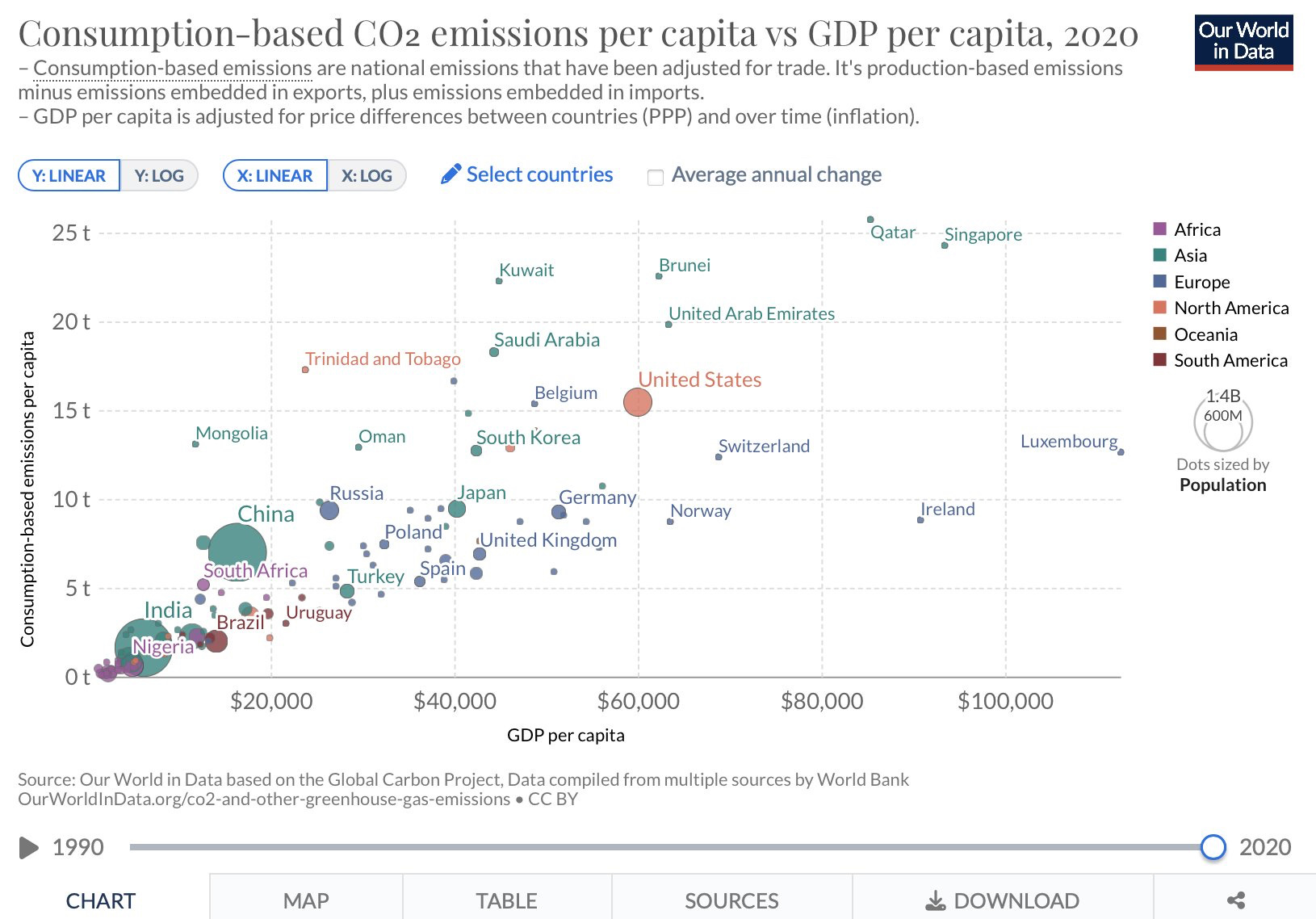
As seen in the above graph there seems to be poor, high consumption emissions countries, as well as rich, low consumption emissions countries. Additionally there is a trend that more emissions leads to more GDP, but I suspect this is simply a function of an accounting identity. To consume is by definition either consuming energy directly (a service) or a good created using some energy, while GDP is a function equaling the sum of consumption, investment, and government spending. So even though there is variation, there is necessarily correlation due to how GDP is defined.
So what this is saying is that consuming more leads to more wealth? I guess that is kind of how an economy works :) By paying for more things, you pay other people more, and in turn you get paid for selling your things. That’s just assigning value to more things that otherwise wouldn’t be assigned. Or simply, accounting.
There is evidence for decoupling
The long run historical relationship between GDP and energy use may be coming to an end however, as energy usage has become more efficient, economies have become more service oriented, and we’ve assigned value to more things (like information in the digital age)

So the claim that energy use is necessary for wealth may have been historically accurate, but that doesn’t mean that in the future it will also be true. Past returns are not necessarily indicative of future returns!
What to make of our original graph
Unfortunately, there isn’t a clear picture of what that original electricity usage vs GDP graph really means. It might mean there is correlation between energy and wealth, or that there used to be a correlation in an age where manufacturing was more dominant, or that there is no correlation and all we see are things that we’ve defined to have correlations to begin with.
When making these graphs however I did notice that many high electricity use, rich countries were located in cold climates. So I graphed the average yearly temperature (data here) against both electricity use and income to see if there were any patterns.


Unfortunately, the average temperature was not weighted based on where the populations lived in each country (hence the pink dot all the way to the left on each is Canada and red is Russia and has a very low average temperature but most people don’t live in those temperatures), but in each case you can kind of see a general U shape. I take this as people generally prefer mild climates, and are willing to do work to make energy to keep their (observed) climates mild.
So maybe this is what we are seeing in the electricity vs income graph. That harsh climates forced countries to do work to stay alive, and this work translated into economies which were built up over time to offer a variety of goods and services.
Of course there is nuance to this and variation in each countries historical and political background, but maybe the path dependence here is too strong to overcome, and a simpler explanation might account for something.
All this goes to say that one should be careful of assertions based on evidence. Numbers never lie, but sometimes people lie with numbers. And what you think is conclusive might only be part of the story.
As someone who doesn't always take the time to look into claims people are making on the internet, I really appreciate this deep dive into something that I would've probably taken at face value and repeated to other people as fact. Really enjoyed this breakdown of information and i'm glad decarbonization and wealth of countries aren't at odds with each other!
An interesting point to consider as well is the fact that economies will increase electric demand drastically, but will see related carbon emissions drop. For example, peak demand in the Midwestern USA (MISO) is around 120 GW today. However, projects currently in the queue for interconnection total 160 GW - around 135 of which is purely wind and solar!
So, while there’s some understandable correlation between GDP and energy consumption (though not one to be overstated as you show here :) ), the link to emissions hopefully becomes much smaller, thanks to the favorable econs of today’s renewable generation sources